

How to Build a Great Homepage
A great homepage is actually simple. Really simple. It tells your visitor instantly that they are in the right place or not (we don’t need people hanging around that aren’t really interested in what you offer). But we do want to ensure we attract your target customer. And we want to make it really easy for these visitors to buy or get in touch (depending on your objective).
You only need a maximum of ten elements to create a great homepage:
Website usability is one of the key factors in the success (or failure) of your website. You need to try and approach it from the perspective of someone that knows very little about you and your products and services. Have you made it instantly possible to find out what you are about, what you do and how they can hire you or buy from you?
If you manage your own website using wordpress or squarespace then you should be able to make some simple changes yourself to optimize your homepage. If you need advice or need someone to make the changes for you, get in touch. You can make small improvements all the time. Websites are never finished, they just evolve into better versions of themselves.
Here are a few of my favourite homepages if you need some inspiration:
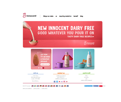
The innocent website is so simple and clear, yet full of their personality. Everything is above the fold (fits into a browser screen) which is pretty awesome too.
I love the busy and organic style of the Riverford Organics homepage. It’s got quite a lot going on but I think it works because it feels like a busy farmers market. They have a strong and well known brand so can afford to be a little more creative. However they have a very annoying security setting on the site to deter spam attacks, which is a miserable user experience. I do not recommend that approach!

So obviously I built My Outsourced Marketing Team’s homepage to the principles I write about in this article. But it’s never really finished. I am constantly returning to it to tweak details to improve performance. In particular sign-ups for my newsletter have increased considerably thanks to a few little iterations I have made in the last few weeks.

Need some help or advice to optimise your homepage?
Book a Power Hour with me and I can review your homepage and create a list of improvements to make it convert.
Isn’t this HelloFresh homepage so clear about what they do and how it works? Clever use of the social media feeds to provide testimonials too. I am a customer but their website and branding is part of the reason!

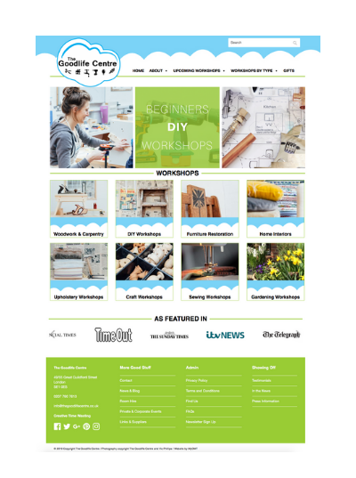
I built The Goodlife Centre’s website so I am naturally biased, but it was built to the client’s design. It seems she instinctively knew how she wanted visitors to move around the page and it works - I made a few additions and this website converts very well.
I really love the boldness and absolute clarity with which The Membership Guys built this homepage. You know exactly what they do and how they can help you. I’d love to have seen earlier versions of this to see what came before because I’ll bet this has been created based on experience and user feedback.
